
If you’ve ever ended up with washed-out, muddy hues or clashing color combinations when working on a piece, the issue almost never comes down to a lack of practice. It usually stems from skipping the foundational, underlying rules that govern how colors interact. Below is a streamlined, universally applicable breakdown of core color principles that works across all creative scenarios.
1.Core Color Categories
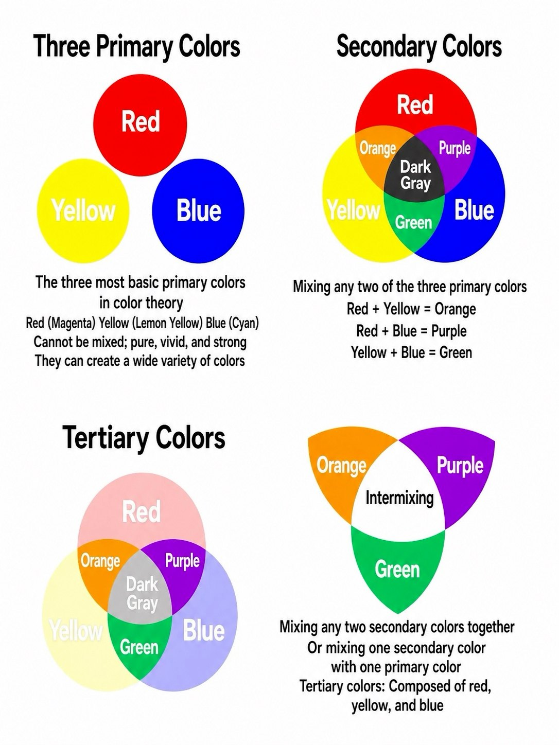
- Primary colors: The irreducible base colors that cannot be created by mixing any other pigments, often referred to as first-order colors.
- Secondary colors: The three distinct hues that form when you combine equal parts of any two primary colors, which are orange, green and purple.
• Tertiary colors: The full range of nuanced shades you get when you blend a primary color with its adjacent secondary color, also widely known as third-order colors.
2.Three Defining Traits of Every Color
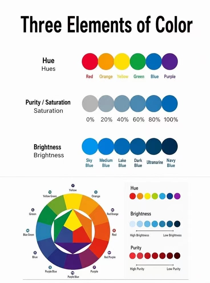
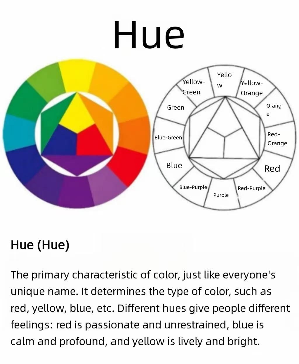
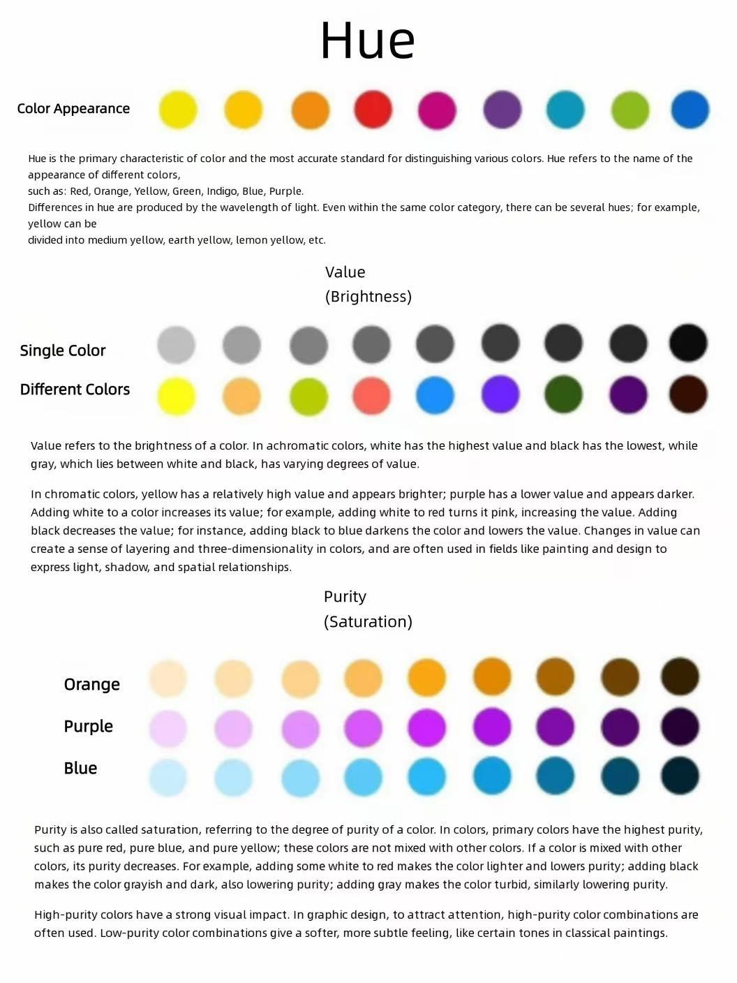
- Hue: The unique identity that sets one color apart from another, the basic label we use to name what we are seeing, like red, yellow, blue or purple.
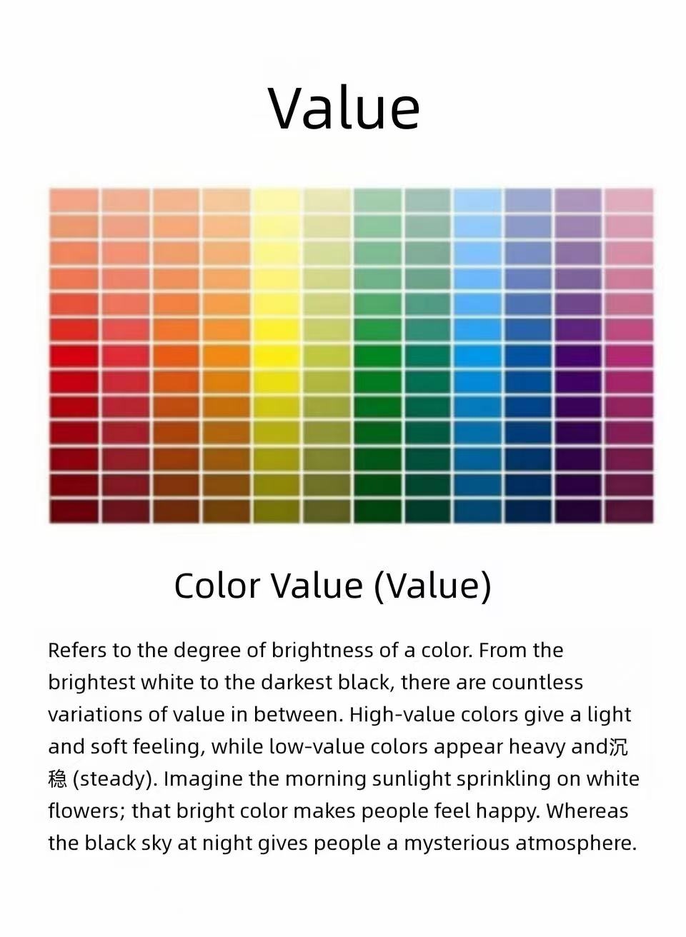
- Value: The lightness or darkness level of any given color. A higher value pushes the color toward a brighter, more vivid presence, while a lower value pulls it into deeper, more muted, shadowed territory.
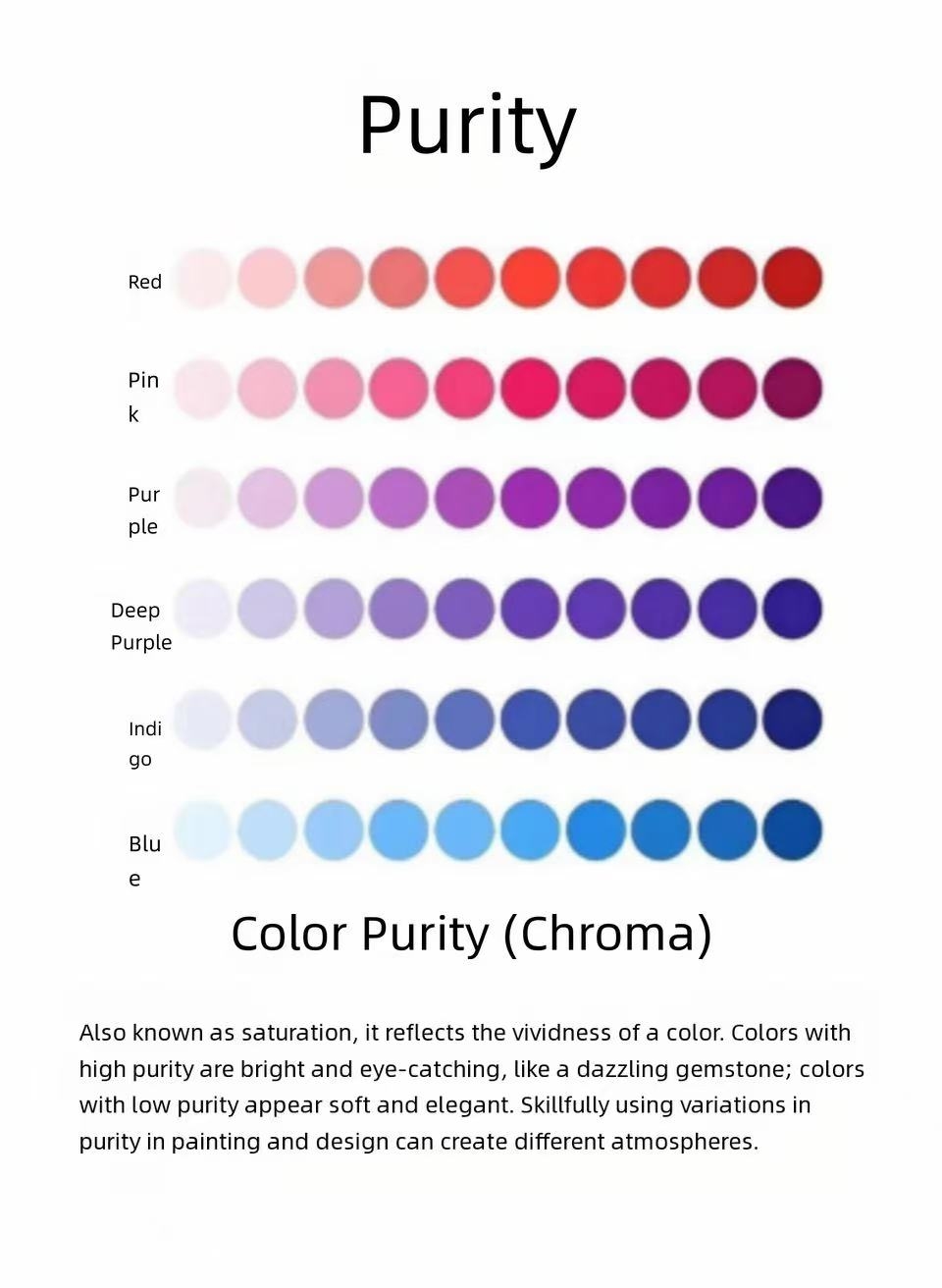
- Saturation: How vivid or muted a color appears to the eye. Highly saturated hues pop immediately and draw attention, while low-saturation tones read as soft, gentle and understated.
3.Common Color Pairing Dynamics
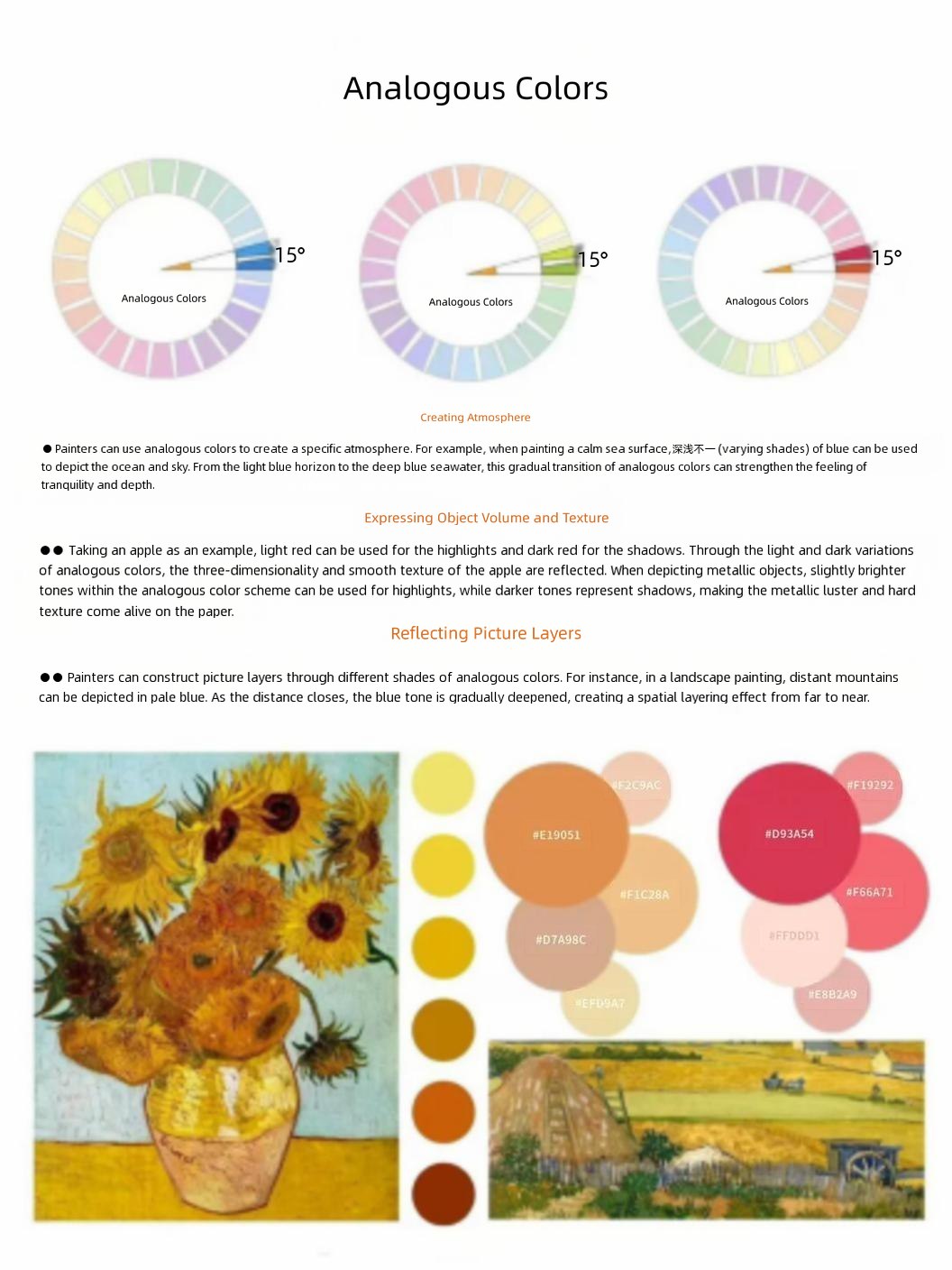
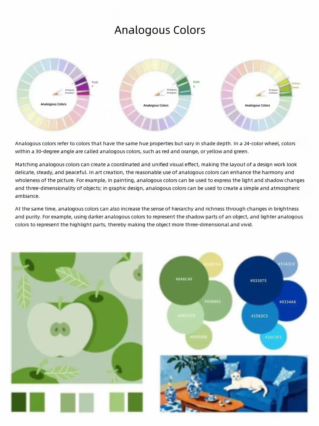
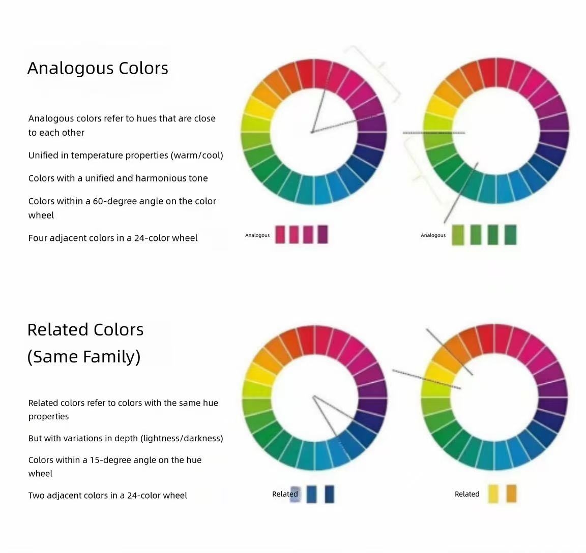
- Analogous colors: A tight set of hues that sit very close to one another on the color wheel, creating a seamless, cohesive palette that never feels disjointed.
- Adjacent colors: Hues positioned right next to each other on the color spectrum, adding subtle, natural variation that makes a composition feel layered and full without clashing.
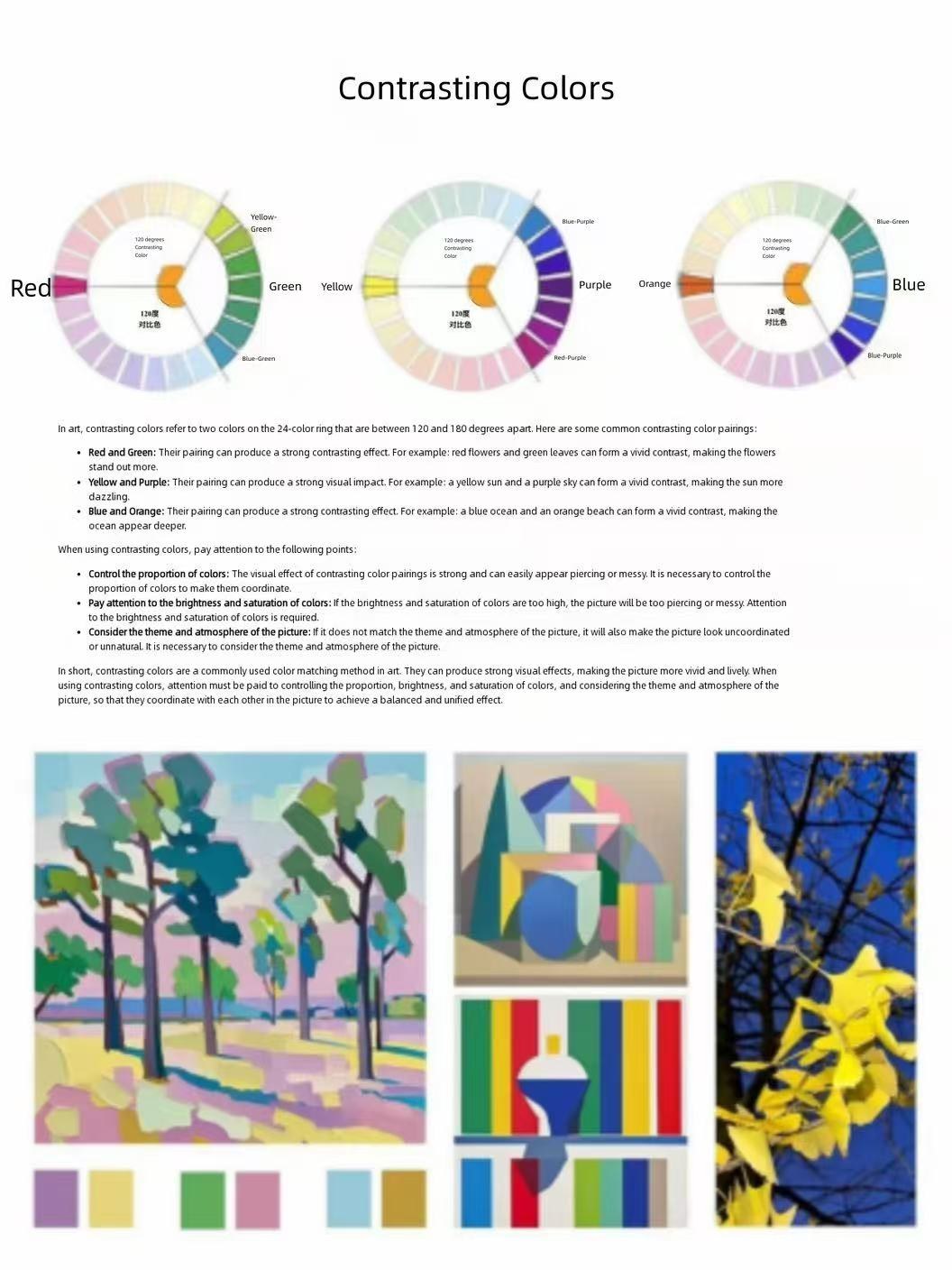
- Contrasting colors: Hues separated by a wide gap on the color wheel, generating a bold, eye-catching dynamic that grabs the viewer’s focus right away.
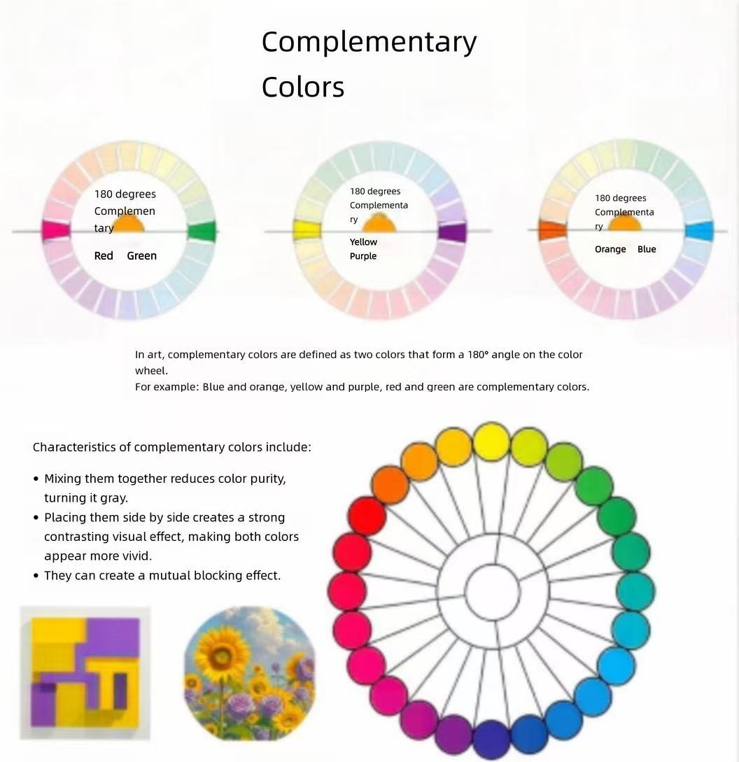
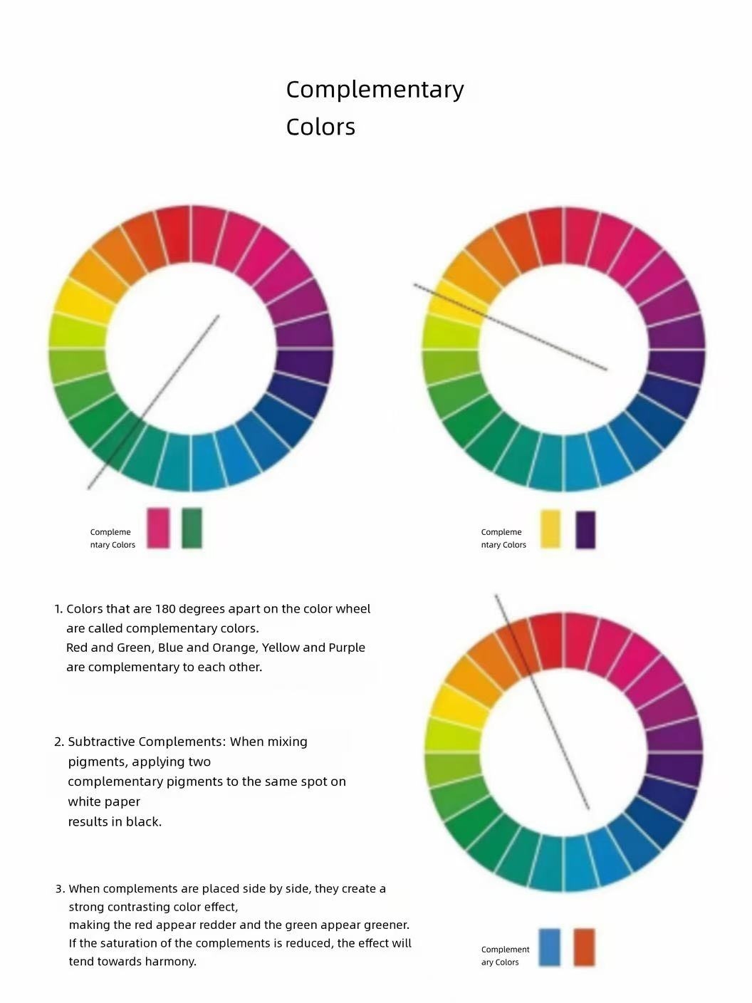
- Complementary colors: The exact pairs of hues placed directly across from each other on the full color wheel, creating the sharpest, most dramatic visual contrast possible.
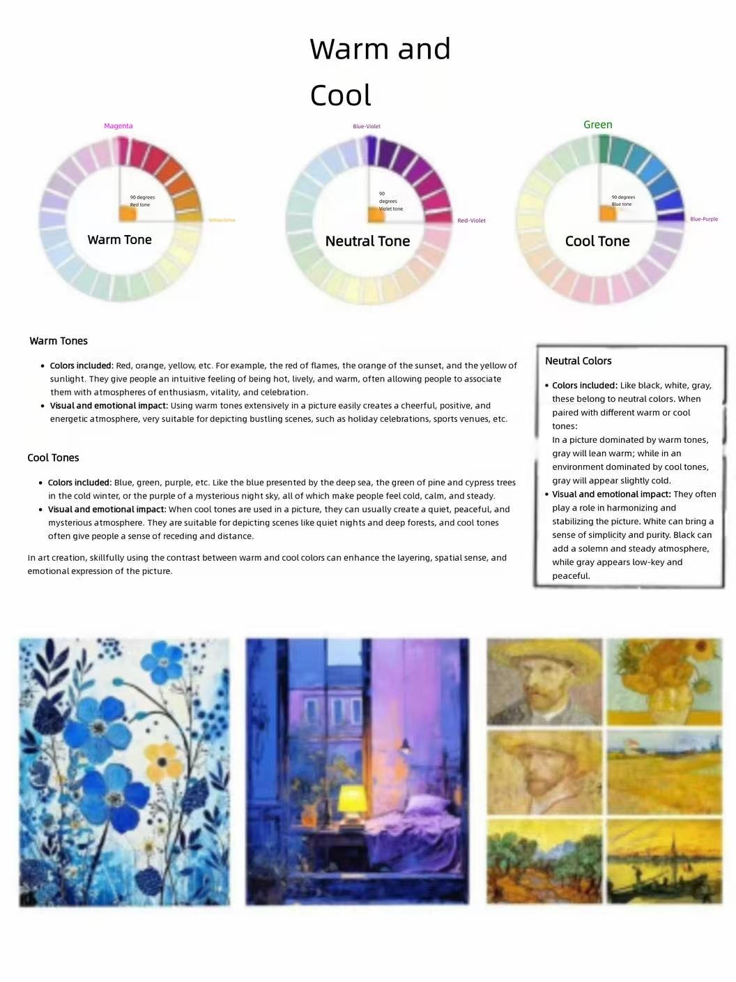
4. Color Temperature Perception
Warmth and coolness in color are not fixed physical properties, but a shared subjective visual experience. Cool tones carry a sense of freshness and quiet calm, while warm tones feel energetic, rich and enveloping.
Once you internalize these basic rules, you will no longer have to guess your way through color adjustments. Whether you are mixing acrylic paint for a canvas project or blending custom hues for a hands-on craft, these principles will give you a clear, reliable roadmap for every color choice you make.